’23 City Editions are Slam Dunks
Contrary to popular belief: colors are in fact for everyone!
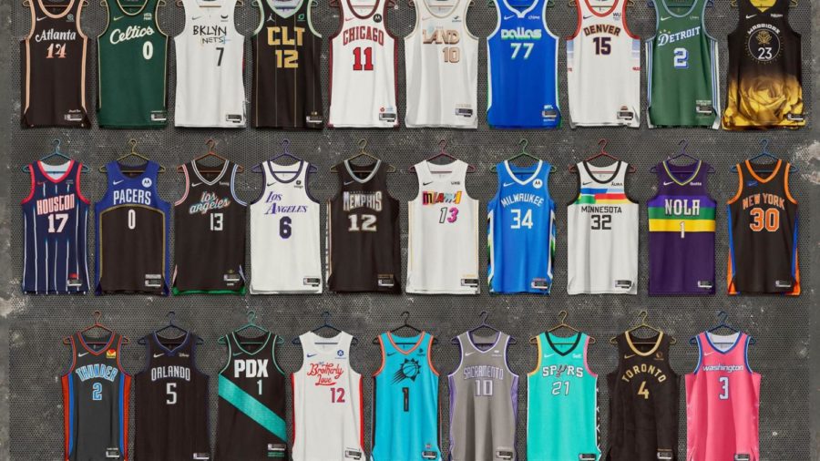
Photo NBA
The ’22-’23 City Edition Uniforms released by the NBA.
April 17, 2023
Editor’s Note: This was created for the FSPA 2023 Spring Convention On-the-Spot Review Writing and placed first.
Across North America, the NBA has 30 teams across 21 states and one province. In every city that hosts a team, there is a unique culture that not only stems from a shared love for basketball, but from communities and their citizens. To show off these unique cultures, Nike and the NBA have been producing a collection of jerseys each year since 2017 themed around each city and its heritage. Their most important job however, is to look good on players and fans.
A fan favorite this time around has been the Memphis Grizzlies new edition. The jersey is black with gold and patterns made to look like diamond-encrusted jewelry along the right side. The shape and style of the “Memphis” wordmark draws inspiration from local album art, such as Three six Mafia. This bold jersey celebrates the rich Hip-Hop culture of Memphis. This jersey is not only one of my favorites because of it’s meaning, but because it manages to stand out without looking tacky. Plenty of the jerseys this year are black, but this diamond-like pattern is completely unique. The best part is just above the jersey tag, where you will find the words “For the M” and a gold grill shaped like Grizzly Bear fangs surrounding the M.
The Washington Wizards jersey has had a mixed response, but I personally think it’s one of the best in this years line-up. Shirley-Temple pink in color, there are designs along side of the cities famous cherry blossoms. The shorts are the same shade of pink, but fade into a dark purple and then a dark blue along the hem. I totally understand why people didn’t love these uniforms. They have a more feminine energy that most people don’t love. The dot on the I in Washington is even a little flower. However, I do think that these opinions are lame. This jersey is fun, bright and colorful. Other than politics and museums, the blossoms are what draw people to D.C from around the country.
The Oklahoma City Thunder’s jerseys were based around the values the Oklahoma citizens live their lives by, “The Oklahoma Standards”. Apparently, these standards don’t include an understanding of a color wheel. The meaning behind these jerseys is actually very sweet, and that is appreciated. However, this was executed very poorly and they are just ugly. The neckline and the side panels are lined by racing stripes of three colors that do not go together: A burnt sienna, a light orange and a baby blue. These colors are meant to represent the terrain of Oklahoma and the foundation it has been built on. On the inside, over the wearers heart, the three words “Service. Honor. Kindness.” are stitched. This small detail is the best part of this design and drives home the connection to heart and family, even if the colors are not pleasing.
While all fans won’t love every jersey, the point of the city editions is to connect with fans. Everyone wants to see their city and culture represented.