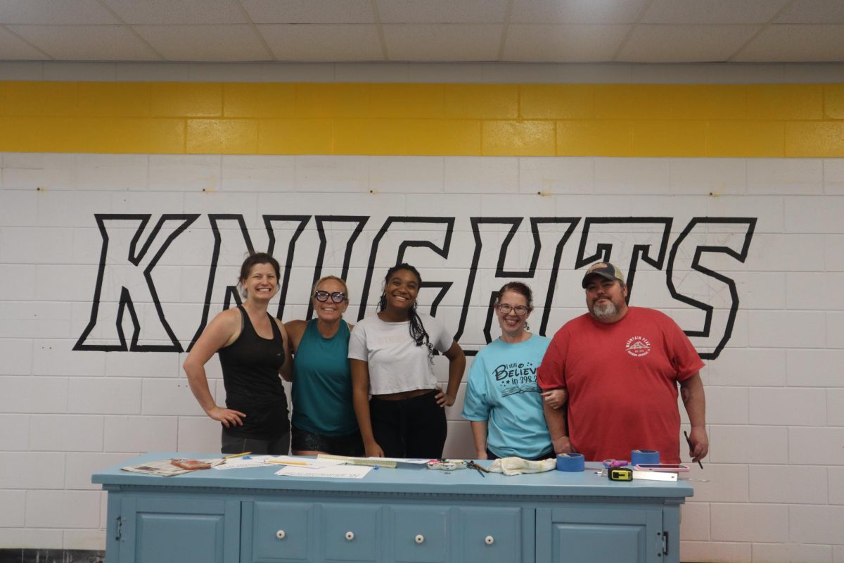
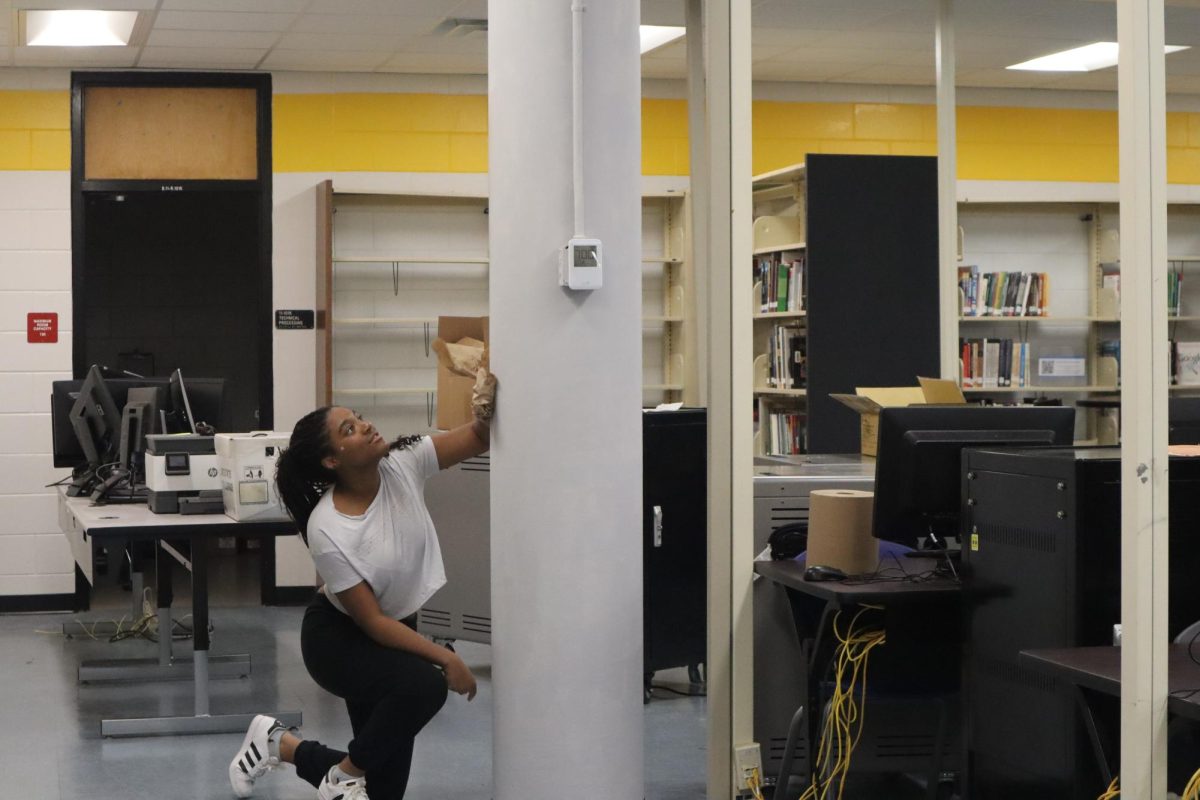
Robinson’s library has embraced a vibrant new chapter this spring, thanks to the collaborative efforts of students, PTSA members and the bright and vibrant spirt of librarian Shannon Chamberlin. The fresh paint on the walls is not merely a change of color but an invitation to students to engage with a space that’s both welcoming and dynamic.
The color selection, particularly the vibrant yellow, accented with complementary shades of gray and blue was strategic. Lyric Harris (’25) commends the choice noting that using a bright color like yellow to paint was a great idea because it brightens up the space and gives a much more inviting look to the library.
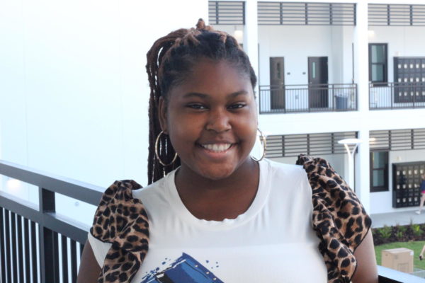
“It’s hard to remember what the library looks like before the painting because the changes are eye-catching and great. Overall, I think that the new look will create a more inviting atmosphere for students and maybe even convince more students to visit the Media Center,” Harris said.
Chamberlin’s plans don’t just stop with paint. She intends to introduce chalkboards and displays to promote student art and expression.
“I have a bunch a different ideas as always and I’m going to bring in chalk and im definitely going to wrote things as you walk in and see the circulation desk like advertisements and signage. I like things to change and be fresh and new all the time so I think chalk board is great because you can erase it and start over and try something new,” Chamberlin said. “If there are artistic students I want to welcome them to come in and give them and end cap and do want ever they want to express themselves as long as it’s appropriate. I’m not super artistic I just appreciate art a lot. That’s why I liked the idea of chalk paint because we change and evolve.”
Accompanying the new painting in the library Chamberlin has also redecorated the display case. She visualizes a dynamic showcase that rotates various items from student art work to collections of books. While considering potential themes Chamberlin is drawn to the symbolism of a rainbow, representing hope and brightness which she believes aligned with the library’s new inviting atmosphere.
Chamberlin acknowledges that being positioned somewhat in the back corner hides the Media Center away from students who might not know that it is there. She hopes that the new vibrant makeover will serve as a beacon for students drawing them in with it’s welcoming ambience. She envisions students entering the library and immediately feeling a sense of awe and comfort whether they are avid readers or not. By creating a space that transcends traditional perceptions of library’s Chamberlin aims to showcase the diverse opportunities within it’s walls from reading to artistic expression and beyond.
“I wanted the library to be bright, warm and inviting and I felt like it was kind of dull and lack luster. I want students to feel welcome, safe and excited to come into the library,” said Chamberlin.


