Edsby is one step ahead
Canvas still sucks
Photo Sarai Cochran
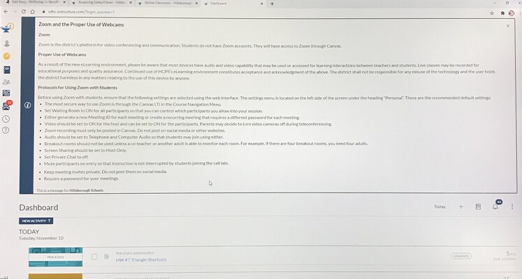
The Canvas homepage, displaying classes, a to-do list and more.
November 10, 2020
From 2016 to early 2020, Edsby is what I’ve used to navigate, update and observe my grades. Since the beginning of the school year, Canvas has taken its place because of COVID-19, which has been a battle for everyone.
Overall, just the look of Canvas is very crowded. Everything’s thrown in your face compared to Edsby which is very spread out, organized and well-structured.
Edsby has everything sorted out. Classes to the left of the screen, calendar to the right, inbox and notifications to the very top and groups at the very bottom all on the front home screen.
On the flip side, Canvas has courses, groups, calendar and inbox all to the left of the screen, making everything look packed. It’s overwhelming having to click every button instead of it being there for us.
Having to log in to Canvas is a pain as well. The quickest way to login to Canvas is through Clever. Even logging through Clever is time-consuming. Going to Clever, logging into Clever, clicking Canvas then having to log in just to get where is needed. Having to login twice to get where I need, it’s just so annoying with no purpose
On the other hand, Edsby is very easy to get to. Typing “Edsby SDHC” and clicking the website will bring you straight to the login. It’s so much more convenient and suitable.
Edsby also has a help guide tour. It’s a quick one minute and 26 second video explaining how Edsby works and how it is useful for school. The next eight slides go into thorough detail about each part of Edsby like recent activities, classes, calendars, etc.
Canvas has a help guide too, but instead of videos and slides they have websites that you can click to read. A good thing about it is that they have information for students and parents separately. They have student websites for kids who have questions and they have a family website for the parents or guardians who are confused and who want to monitor their child’s progress.
Edsby is known for the cute rectangle-shaped character in the front of the login and at the top left of the home screen. It has its own cute character and style that made you think of it. Canvas just has the Hillsborough County symbol with a tea kettle shaped object and a light at the tip of it. It’s so boring and bland.
Canvas has some really cool gadgets and options that come in handy too like showing what things are missing, late, and completed. Something I also like is when you turn in something, there’s confetti popped on your screen, it’s so cute. But, Edsby overall covers most things that Canvas can’t, like organizing classes. In Edsby, you can drag the classes in the right order unlike Canvas, where the classes are scrambled and you can’t move them around as you please.
It’s been two months since school started and I still don’t like Canvas. I understand that Canvas is something that has been brought to Robinson as a part of COVID-19, but they could’ve updated Edsby instead of giving a whole new website that everyone has to try to figure out. Canvas is just too much with lots of work to be done.
