Red Doesn’t Belong at RHS
The R in RHS isn’t for red.
Photo Janiece Mitchner
Robinson isn’t red.
April 5, 2023
For the past year, there has been some remodeling and reconstructing of Robinson; meaning many things are changing. One design detail the admin added was red seats within the cafeteria.
With this being said, they want to add red as our accent color to our original colors of black, grey and white. The red would be making us look like Hillsborough or even Freedom high school.
What I don’t understand is why all of a sudden the administration believes the school should have this POP of color when it’s always just been black, grey and white. It is just a huge change for everyone since it hasn’t been incorporated into anything for years.
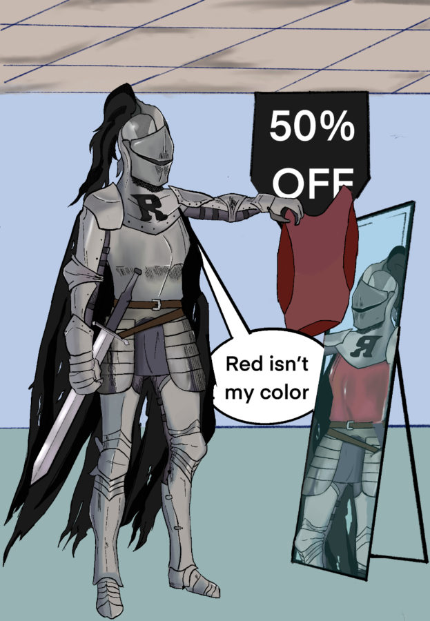
Since black, white and grey are the school’s primary colors, I believe grey can be an accent color to the existing black and white. Since grey is a mix of the two colors, it wouldn’t be hard to have that as this “accent” color the school wishes for. Plus, these three colors are what make us the Robinson Knights. There is no red on this knight unless you add blood to the sword; but then, it is not school appropriate. If anything, I think we should have done a deep blue since we have a color scheme on the darker side.
Another thing, if they were to look at all of the extracurricular activities offered at RHS, which ones have the color red in their uniforms? I’ll wait because it will take a while to find that color in any of the uniforms here. The only ones would be starlets with their personally designed outfits. If this was to change, then the school would have to pay for new uniforms for every sport and even band. Which, I don’t believe will happen since the school has been under construction for over a year now and that has cost a lot of money.
Let’s just be honest, red is a bright color that contradicts the three “darker” colors we have right now. Robinson Knights should just stay with black, grey and white since those are the three colors on Mr. Tommy Knight himself.
